“The alternative to good design is always bad design. There is no such thing as no design.”
Adam Judge
Recent Posts
-
 Invest in me and i will invest in you
January 12, 2019
 -
 5 killer design tips – because we are all designers…apparently!
August 24, 2018
 -
 10/20/30 – rule for presentations
August 24, 2018
 -
 A failed shuttle launch, that will improve your presentations
August 23, 2018
 -
 What the f**k happened to PowerPoint?!
August 11, 2018
Categories
5 killer design tips – because we are all designers…apparently!
- Aug 24, 2018
- By admin
- In PowerPoint
- 0 Comments
I love this quote. Its truth is so obvious, but I think it is easy to dismiss. When i talk to clients – I always talk about an opportunity. When you get in front of your audience (whoever that may be), you have an opportunity to swim or drown. When you don’t invest in design, make no mistakes, your output is desgined….its just it has been designed by yourself. Essentially, we are all designers – just some are better than others. If you are creating PowerPoints on your own, here are 5 areas to focus on if you want to improve your designs.
NOT EVERYTHING IS EQUAL
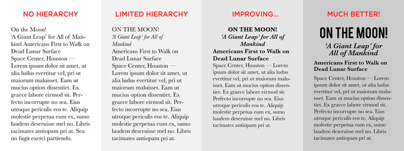
Hierarchy and scale are one of the elements that make or break your design.
Pretend that you are in an elevator and you see your client…you may have 10 seconds, 30 seconds, 2 minutes. You would naturally create a hierarchy of information – what is the main, point, what is the supporting evidence – how can this be proved, for example. Design is no different.
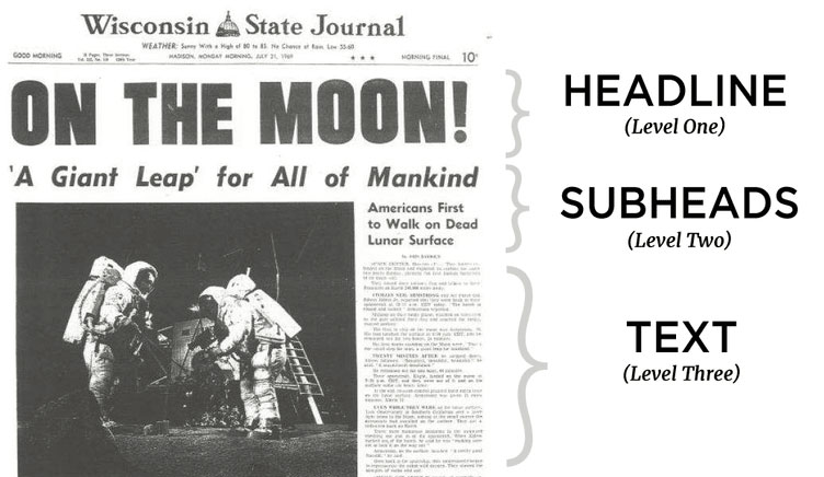
So, you might make a more important element bigger and bolder than a less important element which might be smaller and fainter. See the example below – here the paper engages the audience with the title, provides a supporting headline, and then tempts the reader to read the smaller detailed text.
If all of the copy was the same size Readers would have had trouble distinguishing where one section stops and another begins, making for a harder to read design that has less impact.
LETS WALK THE LINE
When you want someone to looks at something specific, you point towards it. By positioning lines, shapes or photo elements, we can direct the eye to the most important parts of your design. People are inherently lazy… and they owe you nothing with your design. Hold their hand and lead them.
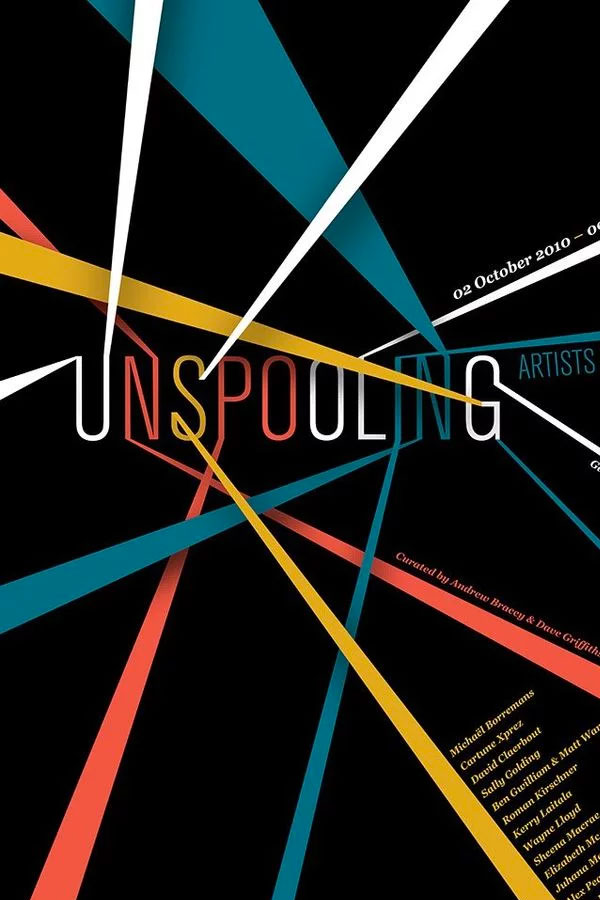
For example, check out this poster design by Design By Day that uses strong leading lines to first guide the eye toward the main focal point (the title), and then to various rungs of information.
Find shapes and lines within your images and graphic elements and use them to direct the eye in certain ways. The design below by Pony and Dogshow pull the eye towards the logo by the creative use of shapes and photos.
FOCUS IS THE KEY
Having a focus in life Is important….in design it is crucial. Remember that the main role of design is communication. Whether you are communicating data, information, feeling or emotion, your design is telling a story – and every story has a beginning and a lead character. So make your sure your design chooses a focal point that tells this in the most efficient, most effective way.
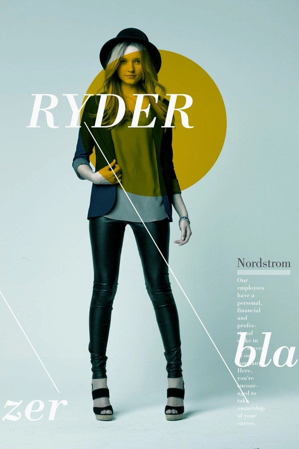
In this design by Mathew Metz, the focus Is the clothes, he literally tells the story in the order that he wants. The yellow circle tells your eyes where to start…we are introduced to a happy beautiful girl the leading lines then draw the eye downwards, gazing over the outfit and finishing with the text, which is seen as being less important.
BALANCE, BALANCE, BALANCE
You see this everywhere – architecture, photography, graphic design, nature, biology. We have been taught that symmetry is good and randomness and chaos is bad. Maybe it is a biological tool for discerning good food from bad or good mates from bad mates.
But what is important is the most successful compositions achieve balance in one of two ways: symmetrically or asymmetrically.
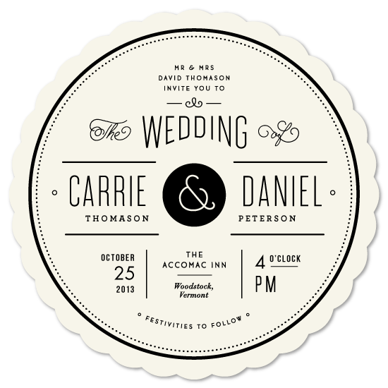
Here’s an example of symmetrical balance. This wedding invitation design by Jennifer Wick uses a symmetrical composition by reflecting the positioning of type and graphic elements. By using symmetry, this design is made elegant, clean, and beautifully balanced.
Another kind of balance and an arguably more common type is asymmetrical balance. Asymmetrical balance is also a fairly self-explanatory term, in that it concerns creating balance without symmetry. The below example by Munchy Potato does this by understanding that the circles are not equal and therefore all have different levels of weight/importance. The artist found balance by placing them as a supporting element. This actually draws more importance to the main circle.
A good technique for mastering asymmetrical balance is to think of each element as having a ‘weight’ to it. Smaller objects might ‘weigh’ less than larger objects, and heavily textured elements might ‘weigh’ more than flatly colored elements. Whatever the case for your design, balance these weighted elements out until you reach an effective equilibrium.
USE COMPLIMENTARY ELEMENTS
You’ve heard of complementary colors, but what about complementary design elements? One key element to a successful and effective composition is taking the time to carefully and purposefully select each element of your design so that each part complements the whole.
Use complementary photos – that don’t fight each other. ensure your photographs look cohesive as they were likely all under the same art direction and photographic style.
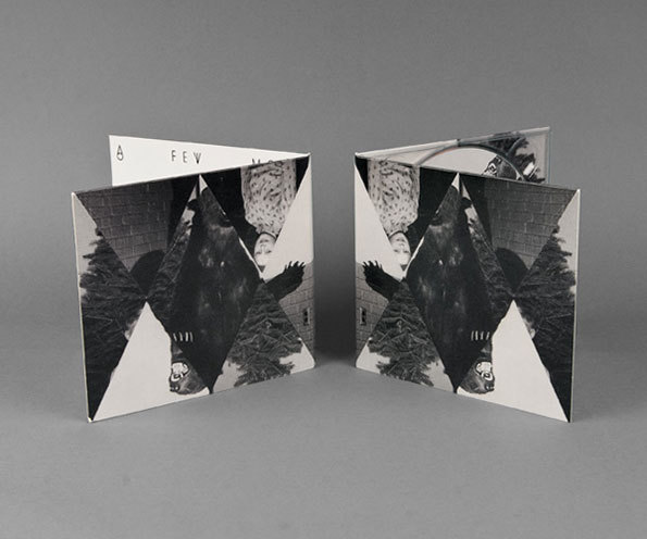
Check out this poster design by A is a Name that runs a monochromatic filter over each photograph to tie each image together in a more natural way.
All elements should ”fit” – typeface, photos, colours. Fitting them to the theme, or the story can really help tell the story.
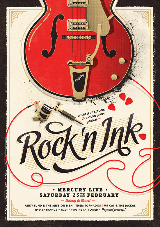
This poster by Adam Hill is for an event “celebrating the link between tattoos and good old fashioned rock ‘n roll.” and the use of traditional vintage-inspired imagery is complemented by a bold cursive title and bold slab serif body copy. A clean, thin, and minimal sans-serif typeface wouldn’t fit the rougher, rock and roll vibe the imagery and concept have developed.
So that’s 5 things to be thinking about when you are designing PowerPoint slides – well….these rules apply to any type of visual art. We love learning about design and the science behind it because we want to make the best PowerPoint slides in the world. If you would like us to work for you – please send an email through to us and we will be back as soon as we can.


