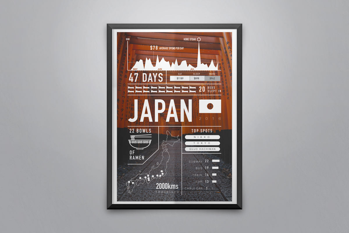
Time in Japan
This is a personal project that I created to tell my story of 8 weeks in Japan. I wanted to show the journey using data, showing that data can be fun. Data can also pull out insights in your daily life. I wonder if we all took count of our daily life we would be interested in the trends – for example…what do we spend our money on? How much? When? Are there any trends that if we looked at the data, we could potentially see room for improvement, or could provide us with some illumination on why we have no money at the end of the month.
Customer : Personal Blog
Categories : Infographic
Skills : Design, Infographic


