“There is nothing more beautiful than someone who goes out of their way to make life beautiful for others.””
Mandy Hale
-
Invest in me and i will invest in you
- Jan 12, 2019
- By admin
- In PowerPoint
- 0 Comments
Two years ago I started my adventure in becoming a creative digital nomad. It was a chance for me to see the world, escape the very comfortable existence, and develop a different perspective on life.
Professionally, i believe that i have learnt so much about what goes into really serving your clients. The challenge of being on a different continent to your client, communicating over Skype calls and emails leave you very exposed for losing business to domestic rivals.
My clients gave me the opportunity to live my dream, even when hiring some guy with a backpack would seem risky, they believed in me. In return, I have worked on trains, plains and automobiles. I have stayed awake working tirelessly in hotel lobbies from dawn to dusk – pulling all-nighters and having phone calls at 2 am, when my client needed to speak to me.
My desire to be a servant to my clients is born from their faith they have in me. I will return to New Zealand in February with a whole new understanding of serving my clients. The way I see it – they invested in my dream… and I will invest in theirs.
A big shoutout to all those people who sent work my way – you are my heroes!
-
5 killer design tips – because we are all designers…apparently!
- Aug 24, 2018
- By admin
- In PowerPoint
- 0 Comments
“The alternative to good design is always bad design. There is no such thing as no design.”
Adam JudgeI love this quote. Its truth is so obvious, but I think it is easy to dismiss. When i talk to clients – I always talk about an opportunity. When you get in front of your audience (whoever that may be), you have an opportunity to swim or drown. When you don’t invest in design, make no mistakes, your output is desgined….its just it has been designed by yourself. Essentially, we are all designers – just some are better than others. If you are creating PowerPoints on your own, here are 5 areas to focus on if you want to improve your designs.
NOT EVERYTHING IS EQUAL
Hierarchy and scale are one of the elements that make or break your design.
Pretend that you are in an elevator and you see your client…you may have 10 seconds, 30 seconds, 2 minutes. You would naturally create a hierarchy of information – what is the main, point, what is the supporting evidence – how can this be proved, for example. Design is no different.
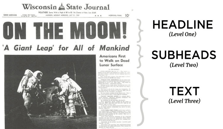
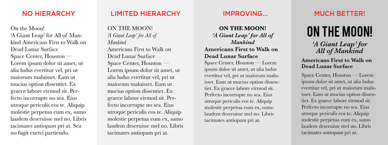
So, you might make a more important element bigger and bolder than a less important element which might be smaller and fainter. See the example below – here the paper engages the audience with the title, provides a supporting headline, and then tempts the reader to read the smaller detailed text.
If all of the copy was the same size Readers would have had trouble distinguishing where one section stops and another begins, making for a harder to read design that has less impact.
LETS WALK THE LINE
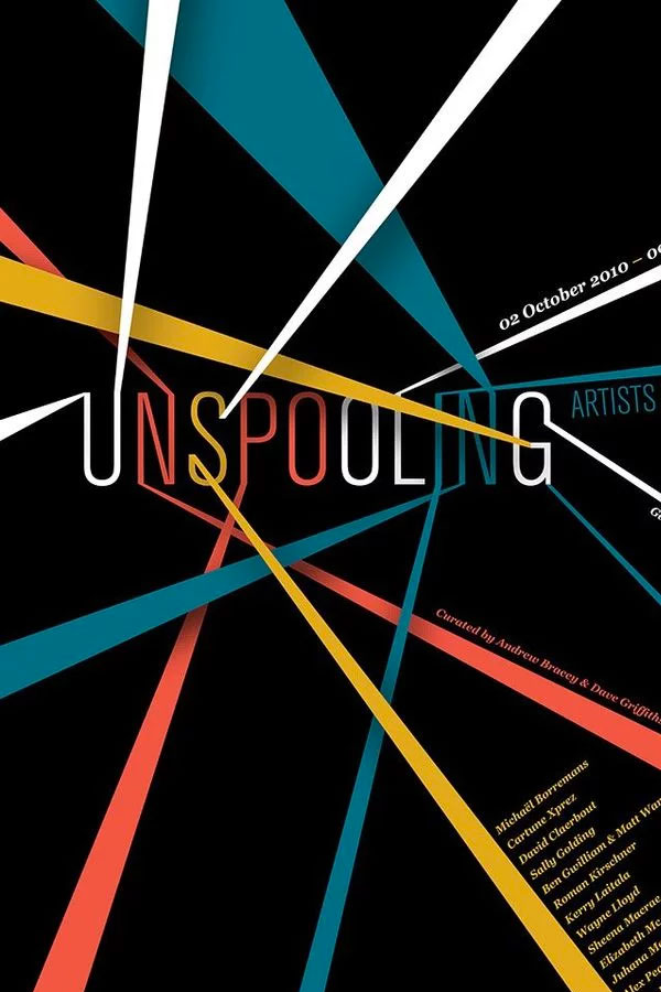
When you want someone to looks at something specific, you point towards it. By positioning lines, shapes or photo elements, we can direct the eye to the most important parts of your design. People are inherently lazy… and they owe you nothing with your design. Hold their hand and lead them.
For example, check out this poster design by Design By Day that uses strong leading lines to first guide the eye toward the main focal point (the title), and then to various rungs of information.
Find shapes and lines within your images and graphic elements and use them to direct the eye in certain ways. The design below by Pony and Dogshow pull the eye towards the logo by the creative use of shapes and photos.
FOCUS IS THE KEY
Having a focus in life Is important….in design it is crucial. Remember that the main role of design is communication. Whether you are communicating data, information, feeling or emotion, your design is telling a story – and every story has a beginning and a lead character. So make your sure your design chooses a focal point that tells this in the most efficient, most effective way.
In this design by Mathew Metz, the focus Is the clothes, he literally tells the story in the order that he wants. The yellow circle tells your eyes where to start…we are introduced to a happy beautiful girl the leading lines then draw the eye downwards, gazing over the outfit and finishing with the text, which is seen as being less important.
BALANCE, BALANCE, BALANCE
You see this everywhere – architecture, photography, graphic design, nature, biology. We have been taught that symmetry is good and randomness and chaos is bad. Maybe it is a biological tool for discerning good food from bad or good mates from bad mates.
But what is important is the most successful compositions achieve balance in one of two ways: symmetrically or asymmetrically.
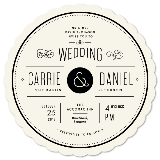
Here’s an example of symmetrical balance. This wedding invitation design by Jennifer Wick uses a symmetrical composition by reflecting the positioning of type and graphic elements. By using symmetry, this design is made elegant, clean, and beautifully balanced.
Another kind of balance and an arguably more common type is asymmetrical balance. Asymmetrical balance is also a fairly self-explanatory term, in that it concerns creating balance without symmetry. The below example by Munchy Potato does this by understanding that the circles are not equal and therefore all have different levels of weight/importance. The artist found balance by placing them as a supporting element. This actually draws more importance to the main circle.
A good technique for mastering asymmetrical balance is to think of each element as having a ‘weight’ to it. Smaller objects might ‘weigh’ less than larger objects, and heavily textured elements might ‘weigh’ more than flatly colored elements. Whatever the case for your design, balance these weighted elements out until you reach an effective equilibrium.
USE COMPLIMENTARY ELEMENTS
You’ve heard of complementary colors, but what about complementary design elements? One key element to a successful and effective composition is taking the time to carefully and purposefully select each element of your design so that each part complements the whole.
Use complementary photos – that don’t fight each other. ensure your photographs look cohesive as they were likely all under the same art direction and photographic style.
Check out this poster design by A is a Name that runs a monochromatic filter over each photograph to tie each image together in a more natural way.
All elements should ”fit” – typeface, photos, colours. Fitting them to the theme, or the story can really help tell the story.
This poster by Adam Hill is for an event “celebrating the link between tattoos and good old fashioned rock ‘n roll.” and the use of traditional vintage-inspired imagery is complemented by a bold cursive title and bold slab serif body copy. A clean, thin, and minimal sans-serif typeface wouldn’t fit the rougher, rock and roll vibe the imagery and concept have developed.
So that’s 5 things to be thinking about when you are designing PowerPoint slides – well….these rules apply to any type of visual art. We love learning about design and the science behind it because we want to make the best PowerPoint slides in the world. If you would like us to work for you – please send an email through to us and we will be back as soon as we can.
-
10/20/30 – rule for presentations
- Aug 24, 2018
- By admin
- In PowerPoint
- 0 Comments
5 years ago I was introduced to the 10/20/30 technique. It was created by a man called Guy Kawasaki who is ‘an American marketing specialist, author, and Silicon Valley venture capitalist.’ – according to Wikipedia. Most notably, he worked alongside Steve Jobs at Apple. This technique or set of rules seems simple – but often the most powerful ideas are.
According to the 10/20/30 rule;
A PowerPoint presentation should have ten slides, last no more than twenty minutes, and contain no font smaller than thirty points.
Guy KawasakiHow many times have you sat in the room while someone drones through a 60-70 slide deck? Reading the title off of the screen and bombarding you with facts and figures? His strategy was to keep his audiences attention by delivering his message with less content, but with more impact.
10 slides
Guy Kawasaki pointed out that it is extremely difficult for us to absorb more than 10 concepts, and so he would limit himself to 10 slides to explain the main points. The 10/20/30 rule also suggests that you use the ten slides to tackle all the topics important to your audience. For a venture capitalist, these topics are the following:
- Problem
- Your solution
- Business model
- Underlying magic/technology
- Marketing and sales
- Competition
- Team
- Projections and milestones
- Status and timeline
- Summary and call to action
What 10 points are most important to your business?
20 minutes
Guy would book in a meeting of 1 hour. But deliver his message in 20 minutes. Ask yourself how much more convinced have you been if someone has an additional 40 minutes to talk to you about a product or sales data or concepts. Instead, he would devote 40 minutes to answer questions and involve his audience. The key to this is having enough faith in what you are selling. If you have a passion for what you are presenting, there is a good chance your clients will also.
30-pt Font Size
Guy pointed out – quite rightly, that the only reason that clients use a font type 12 (or below in some cases) is their insecurities of what they are selling or presenting, resulted in them over-explaining. Don’t make this mistake – your audience may perceive that you are not familiar with your material and you are using PowerPoint as a teleprompter.
The 10/20/30 rule forces you to use a larger font, so you can cut back on unnecessary details. Remember: you’re the one who has to do the talking, not your PowerPoint presentation.
Imagine traveling to a presentation without a clear unmuddied vision of what you are to talk about. Knowing that you will hit the key issues hard and focused way. Then you will have 40 minutes to really talk to your clients and pull from them their questions. A presentation always has a goal – don’t waste the opportunity by losing your audience and over complicating the simple – this is ultimately the rule to success and key to serving your clients in the best possible manner.
-
A failed shuttle launch, that will improve your presentations
- Aug 23, 2018
- By admin
- In PowerPoint
- 0 Comments
An ominous beginning
On January 28, 1986, the Nasa space shuttle Challenger broke apart just 73 seconds into its flight, killing all seven crew members. This tragedy highlighted the potential dangers of PowerPoint, and could be the key to reaching your clients on a deeper level.
It emerged from software company Forethought Inc., a Silicon Valley hothouse, in the 1980s. The program, initially named Presenter, was first released – on the Apple Macintosh – in 1987. Bob Gaskins was the man behind it.
“I knew in the early 80s that there were as many as a billion, a thousand million presentation slides being made per year just in America,” Gaskins says, “but they were all made by hand and almost nobody was using computers to do so.”
An even playing field
Before PowerPoint, people used slides, overhead projectors and acetate films to convey information to groups – but anyone creating a presentation had to send away to get their materials made. It took a long time to do, was difficult to make changes and because it was so expensive, only the most senior people in an organisation got to do it.
The age of the personal computer gave access to everyone in the company to express their ideas in a cost-effective and time-efficient way. Suddenly everyone from the CEO to the mailroom clerk had the opportunity to present their ideas to the company.
Quantity over quality
Now over 30 million PowerPoint slides are created every day. Quantity doesn’t always equal quality, and there are 3 reasons for this.
- Lack of time
- Lack of education
- Lack of confidence
A competitive environment has reduced budgets, resulting in lack of time for work to be completed, lack of edcation of how to use powerpoint as a tool, and lack of confidence in ones ideas and story result in 100s of slides being presented, cramming in as much information as possible and overwhelming clients.
To demonstrate this, let’s return to the original story of the Challenger space shuttle. The primary problem that brought down the space shuttle had been included within a slide presentation given to Nasa before the mission. But it was surrounded by so much other information, buried in a stack of bullet points, it was effectively hidden and therefore missed.
The problem was compounded by the fact that the slide in question contained conflicting information. The top line read;
“The lack of a good secondary seal in the field joint is most critical and ways to reduce joint rotation should be incorporated as soon as possible to reduce criticality.”
With the bottom line reading;
“Analysis of existing data indicates that it is safe to continue flying existing design as long as all joints are leak checked* with a 200 psig stabilization . . .”
I was struck by the contradiction: “If it’s ‘most critical,’ how could it be ‘safe to continue flying’?
Conclusion
So the conclusion is quite obvious – its something that we at Slide and Design are passionate believers in. Make sure you know your story/insight and build every slide to tell that story. If a piece of data is unimportant, that’s fine – have the balls to leave it out. If you feel compelled to give your client this information – create a separate powerpoint. And not every bit of information is equal – take the space shuttle. That information needed to be elevated to greater importance.
Your title should tell the story and your bullet points should support it. Never leave your audience with ambiguity.
We help people with presentations – this is what we do. We work with thousands of keynotes, Powerpoints, and reports and we know what makes a good one. So if you would like any advice at all – please do not hesitate to flick us an email. It is our mission to create the best presentations in the world – join our cause!
-
What the f**k happened to PowerPoint?!
- Aug 11, 2018
- By admin
- In PowerPoint
- 0 Comments
An optimistic new era
April 20, 1987, a company released its first iteration of what would become one of the most popularly used programs. I think if you were to poll a population, there wouldn’t be many who would not have come across this program, whether it be through a keynote presentation, using it themselves, a collection of sales data, maybe a pitch deck or even a video (where it is increasingly being used with youtube to annotate peoples videos.
When it was first released, it was created so engineers had a platform whereby they could communicate with the marketing team. Snatched up by Microsoft this program was bundled in with the Microsoft Family, and it wasn’t long before PowerPoint presentations were being used by the early adopter sales manager, or renegade research exec – eager to present their data and insights in a new flash way….this was the era of optimism as technology took over from the school of old using their acetate slides and projectors.
Turning into a monster…
But something happened…flash forward 20 years, the words “death by PowerPoint” was whispered around the offices and high rises around the world. This humble program was stuck in a really awkward situation between indispensability and relevance in the modern world. Some figures suggest that this all-conquering presentation software is installed on more than a billion computers worldwide and that there may be up to a staggering 30 million PowerPoint presentations created every day.
We have all been in a presentation or keynote, looking at our watches…looking longingly at the door – thinking of whether to go for sushi or subway for lunch. Each slide bringing you closer to a release.
Key contributors to death by PowerPoint include confusing graphics, slides with too much text and presenters whose idea of a good presentation is to read 40 slides out loud.
A sword in your armoury
I would argue that the inability to see powerpoint as just a tool means that we blame the tool and not the workman. The problem is that we have never truly been taught how to use it. When used properly, with the right resources, directed at the right people – I genuinely believe that we can change worlds.
Key to this premise is education. Where do you learn how to use PowerPoint? Who teaches you? What are their aims? What are your aims? I would argue that with the right teacher / or a mind that is accepting of the idea that Powerpoint can do…can transform this program from a stick to be a flaming sword in your armory.
An awesome opportunity
Start with the opportunity….be the intern again, who is presenting his first presentation – look for impact and connection with your audience. The problem with powerpoint is that people don’t recognize the opportunity. A keynote or presentation is not just delivering of information, it is an opportunity to connect with your client or audience and transform their thinking – powerpoint is a great tool that can help with that, but it doesn’t replace your role in the process. Powerpoint is not an extension of you….it is your wingman – it’s your friend. You shouldn’t be reading from it – but it should support some of the points that you say.
Presentations should be fun – go in there with the goal of changing minds – use PowerPoint to highlight your key points – use it to visualise your data, or communicate a feeling – yes (its like art). If you need any advice on how to do this – or would like to hire us to transform your amazing data/content/stories – flick us an email – we are waiting 😀
PowerPoint may not be of any use for you in a presentation, but it may liberate you in another way, an artistic way. Who knows.
David Byrne
Recent Posts
Archives
Categories
Categories
- PowerPoint (5)
Recent Posts
-
 Invest in me and i will invest in you
January 12, 2019
 -
 5 killer design tips – because we are all designers…apparently!
August 24, 2018
 -
 10/20/30 – rule for presentations
August 24, 2018
 -
 A failed shuttle launch, that will improve your presentations
August 23, 2018
 -
 What the f**k happened to PowerPoint?!
August 11, 2018
Recent Comments
Iframe Video
Twitter Feed
- Our Twitter feed is currently unavailable but you can visit our official twitter page @ThemeForest.








Recent Comments